
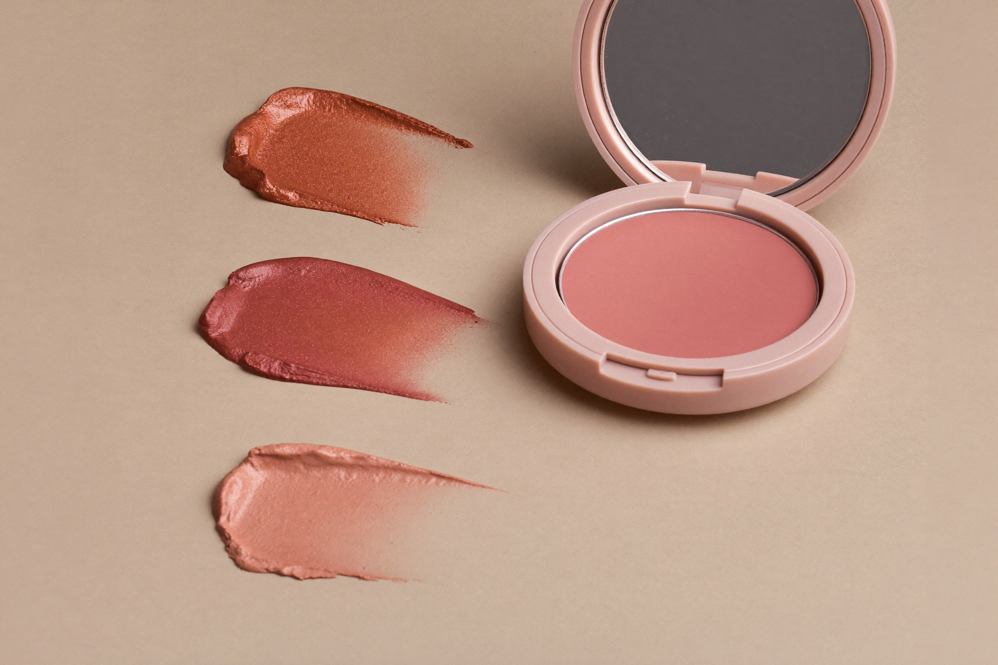
Blush has quietly become the most transformative step in modern makeup. The same product, moved a few centimetres, can lift your features, sculpt them, or give you the look of a day outdoors. The trick isn’t the shade — it’s the placement. Here are the three maps worth learning.
The lifted look: high and back
Smile to find the apples of your cheeks, then place blush above and beyond them, sweeping along the cheekbone up toward the temple. Keeping colour off the lower half of the cheek draws every eye upward and creates an instant lifting effect — the reason this placement dominates on anyone chasing a snatched, elegant finish. Cream formulas blended with fingers keep it from looking striped.
The sculpted look: beneath the cheekbone
Borrowed from editorial makeup, this placement sits blush slightly lower, in the hollow where contour usually goes, then blends upward. The colour does double duty as shape and flush, which is why it works so well with otherwise minimal makeup. Choose deeper, more muted tones — a dusty rose or terracotta — since bright pinks read odd below the cheekbone.
The sun-kissed look: across the nose
Dab colour on the tops of both cheeks and lightly across the bridge of the nose, where the sun would naturally catch. This is the most youthful of the three placements and pairs beautifully with skin-first, low-coverage bases. Keep the intensity soft — two sheer layers beat one heavy one — and pick warm peachy or watermelon tones for the most believable flush.
Match the formula to your skin
Creams and liquid tints melt into dry or mature skin and layer well under or over most bases. Powders last longer on oily skin and grip better over full-coverage foundation. If you love a powder blush but have dry skin, mist your face first; if you love creams but they slide, press a matching powder lightly on top.
The thirty-second rule
Whatever placement you choose, step back from the mirror at arm’s length before adding more. Blush reads differently at conversation distance than at application distance, and almost every blush mistake is an intensity mistake. Start with less, build in thin layers, and let placement — not quantity — do the talking.
Choosing your shade by undertone
Placement gets the attention, but shade does half the work. Cool undertones (silver jewellery flatters, veins look blue) glow in rosy pinks, berries and cool mauves. Warm undertones (gold flatters, veins look green) come alive in peach, terracotta and warm coral. Neutral undertones win the lottery and wear both. The classic test remains pinching a cheek gently and matching the natural flush that appears — your body already knows its colour. Depth matters too: fair skin needs less pigment than it thinks, and deep skin needs more than most ranges historically offered — look for blushes described as bold rather than doubling up on sheer formulas, which adds texture without colour payoff.
Frequently asked questions
Cream or powder blush — which lasts longer?
Powder wins raw longevity; cream wins how it fades (gracefully, like real flush). The double-lock — cream pressed under powder — outlasts both, and it is the standard trick in our wedding guest makeup guide.
Where does bronzer go if I also wear blush?
Bronzer first, where sun naturally hits — temples, hairline, under cheekbones — then blush on the apples and above. Blush over bronzer melds; bronzer over blush muddies.
Can blush replace eyeshadow?
Cream blush tapped on lids is one of the fastest cohesive looks in makeup — our 5-minute face is built on exactly this.
For the clinical baseline on this, see the AAD’s guidance on sun-damaged skin.
KEEP READING — pair softer blush with brown mascara for soft definition.